
WEB DESIGN
Web Design: Learn the Fundamentals of Modern Website Design
Learn how websites are planned, structured and designed for better usability, accessibility, performance and user experience. Explore practical guides covering website design basics, UI/UX, responsive layouts, landing pages, navigation, accessibility and modern design trends.
- Beginner-friendly explanations
- Practical, real-world examples
- Written for website owners and freelancers
THE BASICS
What Is Web Design?
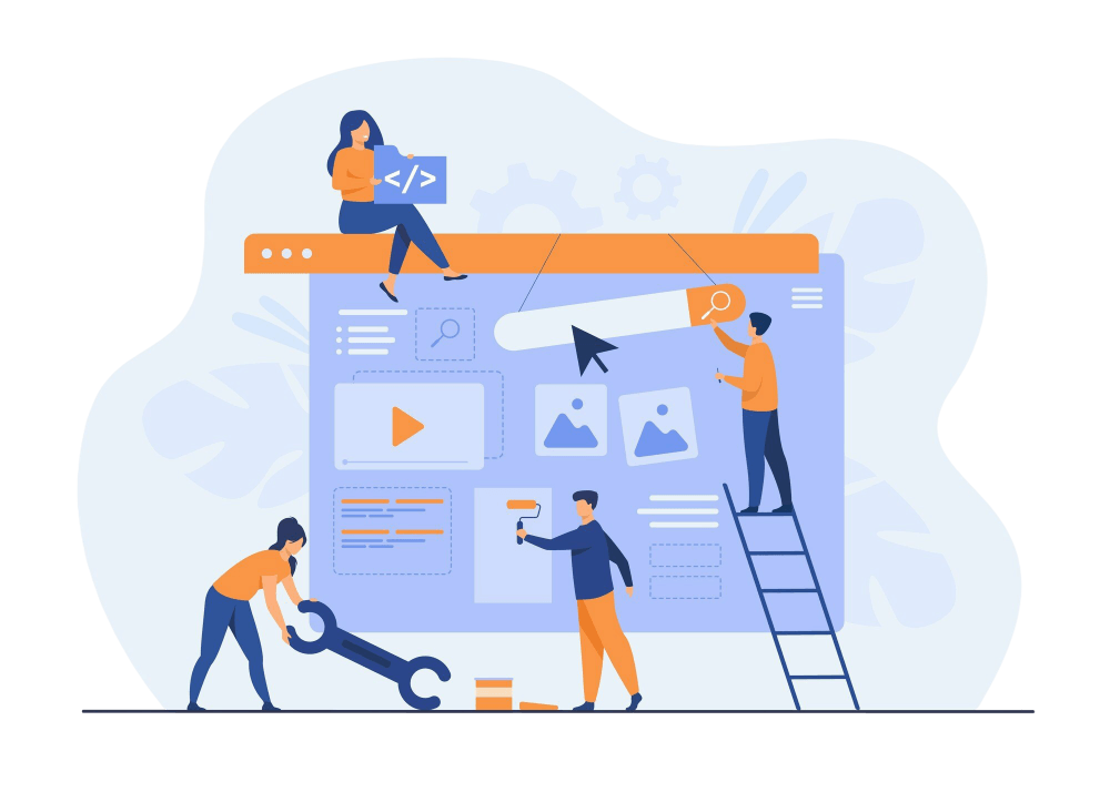
Web design is the process of planning and shaping how a website looks, feels and works for the people who use it. It covers the visual side — layout, typography, colour, imagery and spacing — as well as the structural decisions that determine how easily visitors can find information and complete tasks.
Good website design balances appearance with usability. A clear layout guides the eye, readable type makes content easy to scan, and a consistent colour system reinforces the brand. Behind the scenes, thoughtful navigation, responsive layouts that adapt to any screen, and accessible design choices make sure the site works for as many people as possible.
Design also shapes how a website performs. Heavy images, cluttered pages and confusing structures slow visitors down and make it harder for search engines to understand content. That is why web design sits closely alongside web development, website speed and website SEO. Whether you are building your first site or refining an established one, understanding website design basics helps you make better decisions at every stage.
Web design brings together
- Visual design and branding
- Layout and visual hierarchy
- Typography and colour
- Navigation and information structure
- Responsive, mobile-friendly behaviour
- Accessibility and usability
- User experience (UX)
WHY IT MATTERS
Why Good Web Design Matters
Design affects how people feel about a website within seconds — and whether they stay long enough to read, explore or get in touch.
Better User Experience
Visitors can understand the page quickly, find what they need and move forward without friction or guesswork.
Clear Navigation
Logical menus and page structures help people and search engines understand how your content fits together.
Mobile-Friendly Experience
Layouts that adapt to phones and tablets keep content readable and buttons easy to tap on any device.
Stronger Brand Presentation
Consistent colours, type and imagery make a website feel trustworthy and recognisably yours.
Improved Accessibility
Accessible design removes barriers for people using keyboards, screen readers or larger text settings.
Better Conversion Paths
Focused layouts and well-placed calls to action make it easier for visitors to enquire, sign up or buy.
TOPIC GUIDES
Explore Web Design Topics
Explore practical Web Design guides covering the fundamentals of website design, user experience, responsive layouts, landing pages, navigation, accessibility and modern design trends.
Website Design Basics
Understand the foundations of website design, including layout, typography, color, visual hierarchy, usability and essential design principles.
UI/UX Design
Learn how user interface and user experience principles help create websites that are intuitive, attractive and easy to use.
Responsive Design
Learn how responsive web design helps websites adapt smoothly to desktops, tablets and mobile devices.
Landing Pages
Discover landing page design principles for creating focused, clear and conversion-friendly pages.
Website Navigation
Learn how clear menus, page structures and navigation patterns help visitors find information quickly.
Website Accessibility
Understand accessibility principles that help make websites easier to use for people with different abilities and assistive technologies.
Website Design Trends
Explore modern website design trends, visual patterns, interaction techniques and evolving user expectations.
CORE PRINCIPLES
Key Principles of Effective Web Design
Trends come and go, but these principles underpin almost every well-designed website. Learn them once and you can apply them to any project, platform or page builder — including WordPress.
Visual Hierarchy
Size, colour, contrast and position tell visitors what matters most. A strong hierarchy leads the eye from the main heading to supporting content and then to the next action, so people understand a page in seconds instead of hunting for the point.
Consistency
Repeating the same colours, fonts, button styles and spacing across every page makes a website feel reliable. Consistency reduces the effort visitors spend learning your interface and lets them focus on content rather than on working out how things behave.
Simplicity
Every element should earn its place. Removing unnecessary decoration, competing messages and cluttered sidebars gives important content room to breathe and usually makes pages lighter and faster to load as well.
Responsive Design
Layouts should adapt gracefully from wide desktop screens to small phones. Flexible grids, scalable images and touch-friendly controls keep content readable and usable whatever device a visitor happens to be using.
Accessibility
Sufficient contrast, semantic headings, descriptive links and keyboard-friendly controls help people with different abilities use your website. Many accessibility improvements also make the site clearer and easier for everyone.
Usability
A usable website lets visitors complete tasks without confusion: finding a service, reading an article or submitting a form. Predictable navigation, clear labels and helpful feedback all reduce friction and frustration.
USER EXPERIENCE
Design Websites Around People, Not Just Screens
A website is only successful if it works for the people using it. Good user experience starts with user intent: why has someone arrived on this page, and what do they need to do next? Answering that question shapes everything from the headline to the placement of your calls to action.
Readable typography, generous spacing and short paragraphs make content easier to scan. Simple, predictable website navigation helps visitors move between pages without getting lost. On smaller screens, mobile usability becomes essential — tap targets must be large enough and content must reflow naturally.
Accessibility and page speed are part of the experience too. A beautiful page that loads slowly or cannot be used with a keyboard still lets people down. Finally, clear calls to action remove guesswork so visitors always know their next step. Explore these ideas further in our UI/UX design guides.
User-Centred Design Checklist
Use this quick checklist when reviewing any page on your website.
- Clear page structure
- Readable typography
- Simple navigation
- Mobile-friendly layouts
- Accessible interactions
- Fast-loading pages
RESPONSIVE DESIGN
Why Responsive Web Design Matters
People visit websites on phones, tablets, laptops and large desktop monitors — often switching between devices during the same task. For many websites, a large share of visitors now arrive on mobile. Responsive web design makes a single website adapt its layout to each screen size rather than forcing people to pinch, zoom and scroll sideways.
A responsive layout rearranges columns, resizes images and adjusts typography so content stays readable. It also accounts for touch interfaces: buttons and links need enough space to tap accurately, and hover-only interactions need alternatives. Many designers start with a mobile-first approach, designing for the smallest screen and then enhancing the layout as more space becomes available.
Responsive design is closely linked to performance. Serving appropriately sized images and avoiding unnecessary scripts helps mobile visitors on slower connections — something we cover in more depth in our website speed guides.
Desktop
Multi-column layouts use wide screens without stretching text lines.
Tablet
Columns reflow into fewer, wider blocks for comfortable reading.
Mobile
Content stacks vertically with large, easy-to-tap controls.
Performance
Right-sized images and lean pages load faster on every connection.
Anatomy of a focused landing page
- Focused headline that matches visitor intent
- Clear visual hierarchy from top to bottom
- Prominent, well-placed call to action
- Trust elements: reviews, credentials, contact details
- Scannable content structure
- Fully responsive on mobile
- Conversion-focused, distraction-free layout
LANDING PAGES
Design Landing Pages That Have a Clear Purpose
A landing page is built around one goal — booking a call, downloading a guide or signing up for a newsletter. Unlike a homepage, it removes distractions so visitors can focus on a single decision.
Effective landing page design starts with a focused message that matches what the visitor expected when they clicked. A strong visual hierarchy leads from the headline to the benefits and then to the call to action. The CTA should be easy to spot and repeated at natural points on longer pages.
Trust elements such as testimonials, clear contact details and honest explanations help visitors feel confident. Structure content in short, scannable sections, and make sure the page works just as well on a phone as on a desktop screen.
ACCESSIBILITY
Accessible Web Design Benefits Everyone
Accessible web design means building websites that people can use regardless of ability, device or circumstance. It helps screen-reader users, people who navigate with a keyboard, visitors with low vision and anyone using a phone in bright sunlight. Standards such as the Web Content Accessibility Guidelines (WCAG) provide a widely used framework for this work.
Most accessibility improvements are practical design decisions rather than special features. The cards below cover common areas to review, and our website accessibility guides explain each in more detail.
Semantic Structure
Use headings in a logical order and real lists, buttons and landmarks so assistive technology can interpret the page.
Keyboard Navigation
Every link, menu and form control should be reachable and usable without a mouse.
Colour Contrast
Text and key interface elements need enough contrast against their background to remain readable.
Readable Text
Comfortable font sizes, line spacing and line lengths reduce strain for every reader.
Alt Text
Descriptive alternative text explains meaningful images; decorative images can use empty alt text.
Focus States
Visible focus indicators show keyboard users exactly where they are on the page.
Accessible Forms
Clear labels, helpful instructions and understandable error messages make forms usable for everyone.
Screen Readers
Descriptive link text and proper labels help screen-reader users understand content out of context.
DESIGN TRENDS
Modern Website Design Trends
Website design keeps evolving as devices, tools and user expectations change. Rather than chasing every new style, the most useful trends are the ones that make websites clearer, faster and more usable. Not every trend suits every brand — the right choice depends on your audience, content and goals.
Curious how AI fits in? See our guides on AI for websites.
Clean, spacious layouts
Generous white space and fewer competing elements help content stand out.
Typography-led design
Bold, expressive type carries the visual identity instead of heavy imagery.
Thoughtful motion
Subtle animation that guides attention, used sparingly and with reduced-motion support.
Accessible interfaces
Inclusive design is increasingly treated as a baseline rather than an extra.
Responsive experiences
Layouts designed to feel natural across phones, tablets and large screens.
Subtle micro-interactions
Small feedback cues on buttons, forms and menus make interfaces feel responsive.
Performance-conscious design
Lighter pages, modern image formats and fewer scripts for faster loading.
AI-assisted workflows
AI tools can speed up drafts, wireframes and content ideas when paired with human judgement.
FAQ
Frequently Asked Questions About Web Design
Quick answers to common questions about website design, user experience and modern design practices.
KEEP LEARNING
Related Website Resources
Web design works best alongside the other parts of a healthy website. Continue with these related topics.
WordPress
Build and manage design-friendly websites with themes, page builders and plugins.
Website SEO
Help well-designed pages get found with on-page SEO and site structure.
Website Speed
Keep your design fast with image optimisation, caching and Core Web Vitals.
Web Development
See how designs become working websites through code and functionality.
AI for Websites
Discover practical ways AI tools can support design and content workflows.
Ready to Learn More About Web Design?
Explore practical Web Design guides covering everything from website fundamentals and UI/UX to responsive layouts, landing pages, navigation, accessibility and modern design trends.